
Anima Mundi Zentrum
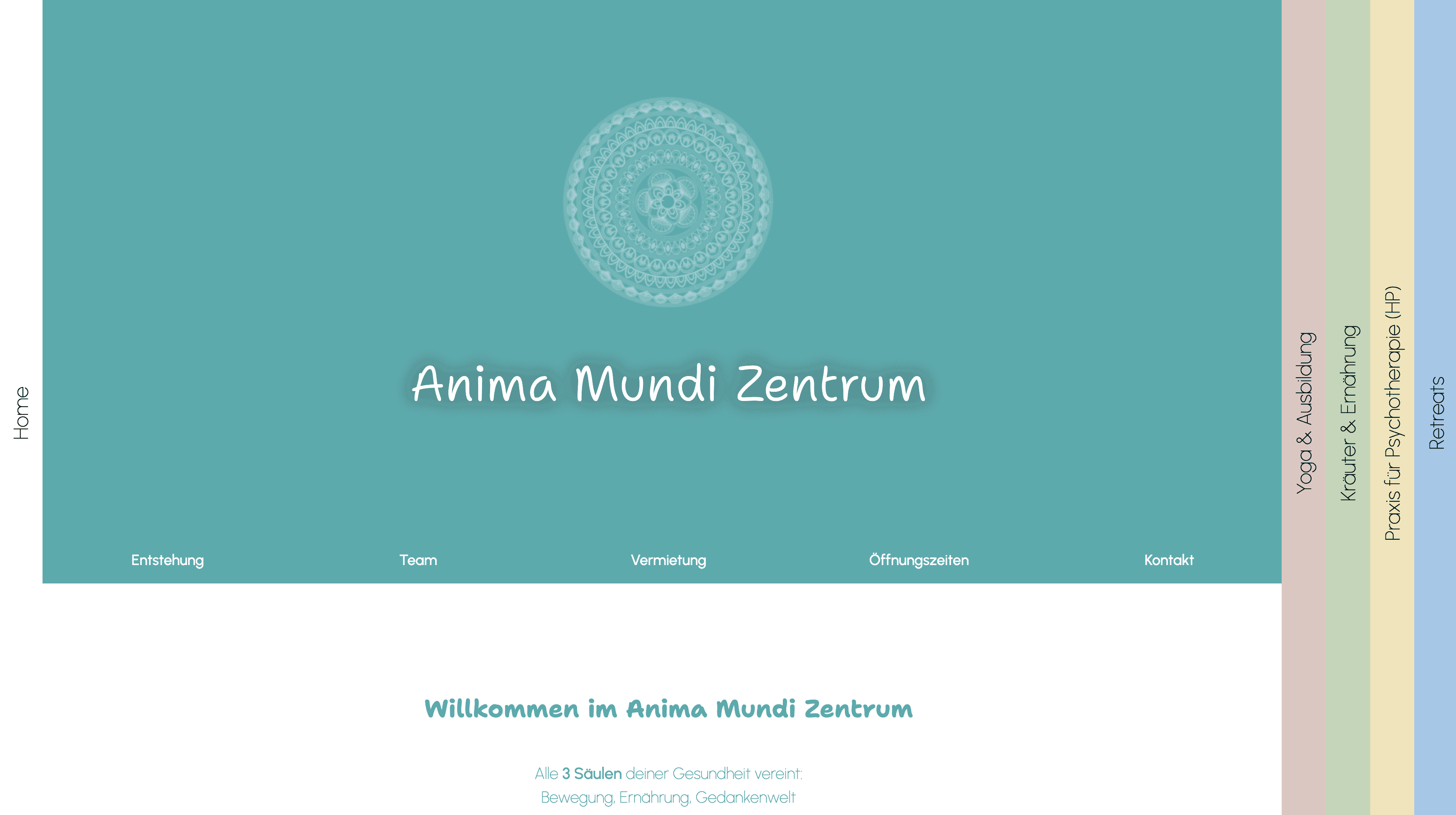
For our very first project at AccelyBiz, the goal was to create an easy to navigate website that communicates all aspects of the wellbeing centre "Anima Mundi Zentrum". This is a fully managed project with little to no manual work by the client.


The initial Situation
The "Anima Mundi Zentrum" is a holistic health-center in Germany, providing Yoga classes, hypno-therapy and psychotherapy, herb-classes and even an intense course to become a yoga instructor.
The center already had a good customer base but everyone still addressed the owner for any simple question, to get information about the offerings, to book classes, and so on. Furthermore, the diverse offerings of the center already were great but it was hard to communicate every aspect to the right target group and still get everything under one, branded, roof.
The owner had already created a website via Wix which provided the necessary information but, due to lack of experience, was not optimized for speed, mobile devices, and scalability. Furthermore, with the growing set of services of the center, the site became hard to navigate quickly. Still, her good eye for a fitting design and her knowledge of her customer base formed a great foundation for the project.
The goals
With the initial situation lined out, we needed to clarify what exactly the goal is of bringing AccelyBiz into the project. We sat down together with the owner to find out what is important to her and her customer group, what her customers already liked about the existing page and what would be the first priority to improve.
It became clear, that we needed to create a website, that:
- is appealing to the customer group
- captures the entire, broad service offering of the center, while still being easy to navigate
- continues the existing design system to be in line with flyers, business cards, and other branding materials
- is entirely managed so she wouldn't have to worry about maintenance or scalability, hosting, domains, etc.
Our work
The first step of our work was to collect every piece of information on the company. We needed to know every single business aspect, every possible future ideas, and the most important (or annoying) questions asked over and over again by customers.
Moving forward, we collected a set of existing branding materials to define:
- Brand colors
- Used typefaces
- Imagery from stock or photo libraries
Having these collected, we started optimizing them, adjusting the colors slightly to ensure contrasts and maintain readability also for visually impaired, categorizing typefaces into headline, content and accent fonts, and creating a moodboard of the images to have an overall style we can stick to throughout the entire project. This ensures, everything is in line with the brand, has a certain standard and is still flexible enough to not become boring.
Afterwards, we categorized all of the service offerings into three main pillars "Yoga", "Herbs", and "Therapy". In order to have an easy to navigate page without a heavily overloaded navigation bar, we proposed a vertical navigation on the three pillars that then, once inside a pillar, show the entire pillar services. That way, we not only reduced the main navigation to only four buttons (three pillars and one "home" page) but we were also able to create a clear separation between the pillars by using one brand color as main color per pillar. Each of these steps of course were closely aligned and worked out together with the owner.
Since page speed was a priority and it was clear that the maintenance stays with us, we opted for an entirely custom coded system that allowed us to create a lean page with custom coded components. No need for bloated plugins, add-ons or huge libraries but still appealing and intuitive. With our mobile-first approach we directly ensured a correct layout across devices, defining essentially three breakpoints: mobile, tablet, and desktop. Every interactivity and animation are carefully crafted with the end-user and page performance in mind.
The result
After completing and testing the page thoroughly, we went back to sit together with the owner of Anima Mundi Zentrum and show her what we worked on. The response to that was great to hear as she really liked how it turned out.
A few adjustments here and there are always necessary to be 100% perfect but these were small and easy to handle, so a few quick-fixes and we were ready to push it online. After finalization, we still had a few additions to the service offering that needed to be implemented but due to a scalable system, this was no issue.
The page lives until today and from time to time we get a feedback from the owner, telling us how she gets compliments for her page. That always brightens our day and we are looking forward to maintain the good partnership.