
Marketing Agency Website
For a fictional marketing agency, we created a fully repsonsive website that focuses on creativity and engagement while being fast and reliable. We covered three basic pages to keep contents simple and focus on USPs.


The Idea
The goal behind this project was to create a modern and very creative website with some new tools to also learn and extend our horizon. Therefore, we thought of the client as a marketing agency - because who needs to look more creative than those, right?
We set ourselves the basic boundaries:
- Standard pages that every agency needs
- Dark mode design with a off-black as the main background color
- A bright orange tone as the brand's main corporate color. Harmonizing and creative.
- Create something special that draws attention immediately and that is completely different from what we've done before
Getting Inspired
So, we knew what we want to reach, now it was time to first get some ideas on how to do it. We sat down and did some extensive googling, finding extravagant solutions for the typical website components. We collected everything that we thought looks cool and that we wanted to include in one way or another and created a moodboard to figure what we can fit together and what would go well for what page (and of course what wouldn't).
Here's a small collection of the things we definitely wanted to use:
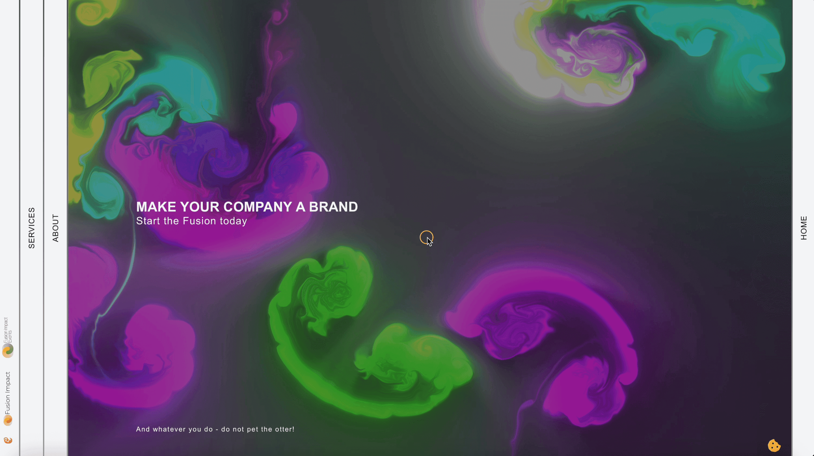
- One of the first "special" things to notice upon page opening is the vibrant fluid color animation on the home page. We found this amazing GitHub repo by Pavel Dobryakov and definitely wanted to use it.
- Very popular with creative agencies: The smooth cursor. We wanted to implement a smooth custom cursor that follows the user's mouse. Not only that, we made it animated to change its appearance according to the underlying element. It grows on hovering a link, it gets wide on hovering a horizontal scrolling slider, and it gets thin on a text input field. That makes the custom cursor not only a fancy gimmick but enhances the user intuitivity of the website.
- In general, we wanted to keep a super smooth experience. Therefore, we stanadardized animations and basic elements, such as e.g. buttons that grow and change their color on mouse hovering or the horizontal slider with boxes that tone a slight 3D effect on hovering through a combined shrink and rotate animation.
- An easter egg. We're big fans of easter eggs anyways so this project definitely needed one as well. Therefore, we included a small otter at the bottom left, that exposes a popup with a custom call to action, when clicked.
The Tech Part
Once we were done with the design for each page, the next step was bringing it to live. Since we wanted to use this as an additional learning experience, we custom coded every part of this by hand.
The frontend of the website (what you see as a visitor) is done in Next.js, a javascript framework that relies on server-side rendering which basically makes the website load crazy fast on your end. The backend (the part of the website that you don't see, where the texts, images, and other content get edited) is done with Strapi, leveraging internal API routes, again making the site load super fast. While fast loading is nice to have because it's convenient for users, it more importantly is a crucial point for a website's reputation with Google. All the data is stored in a dynamic PostgreSQL database.
Quick recap: We have three parts that the website is made of:
- Frontend
- Backend
- Database
In order for the project to be client-ready, we packed all of these three components in so-called "containers" that allow us to ship the site to any server and just start it to have it online. We do this with all websites we build so infrastructure won't impact and complicate the development. Furthermore, because the site lives in a virtual environment, we add an additional layer of security.